
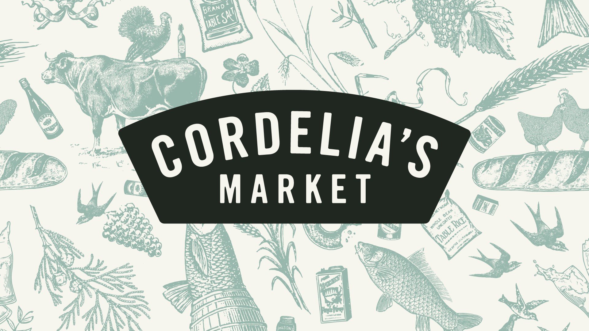
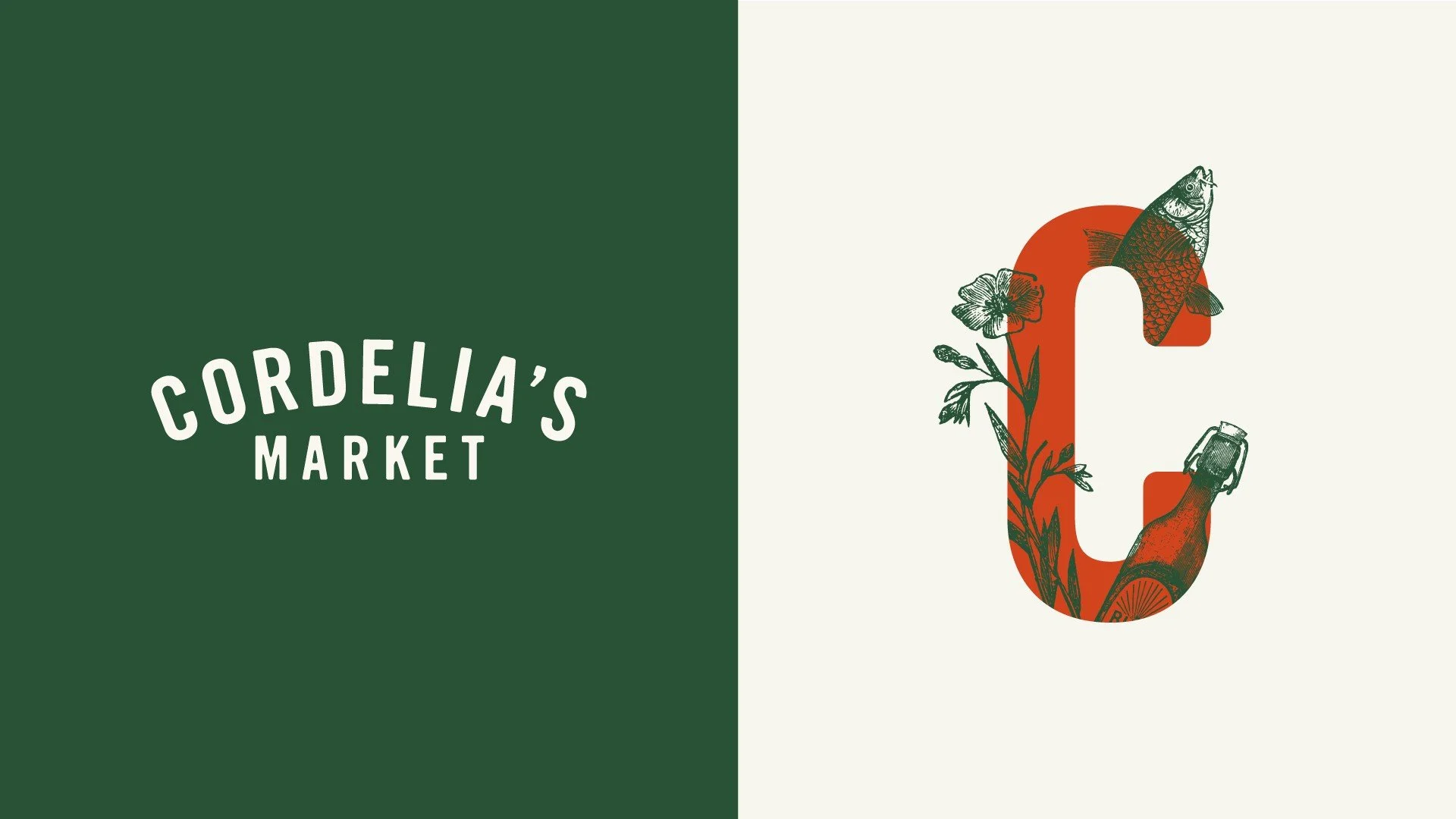
CORDELIA’S MARKET
A warm reimagining of a family grocery store brings contemporary comfort to a neighborhood staple.
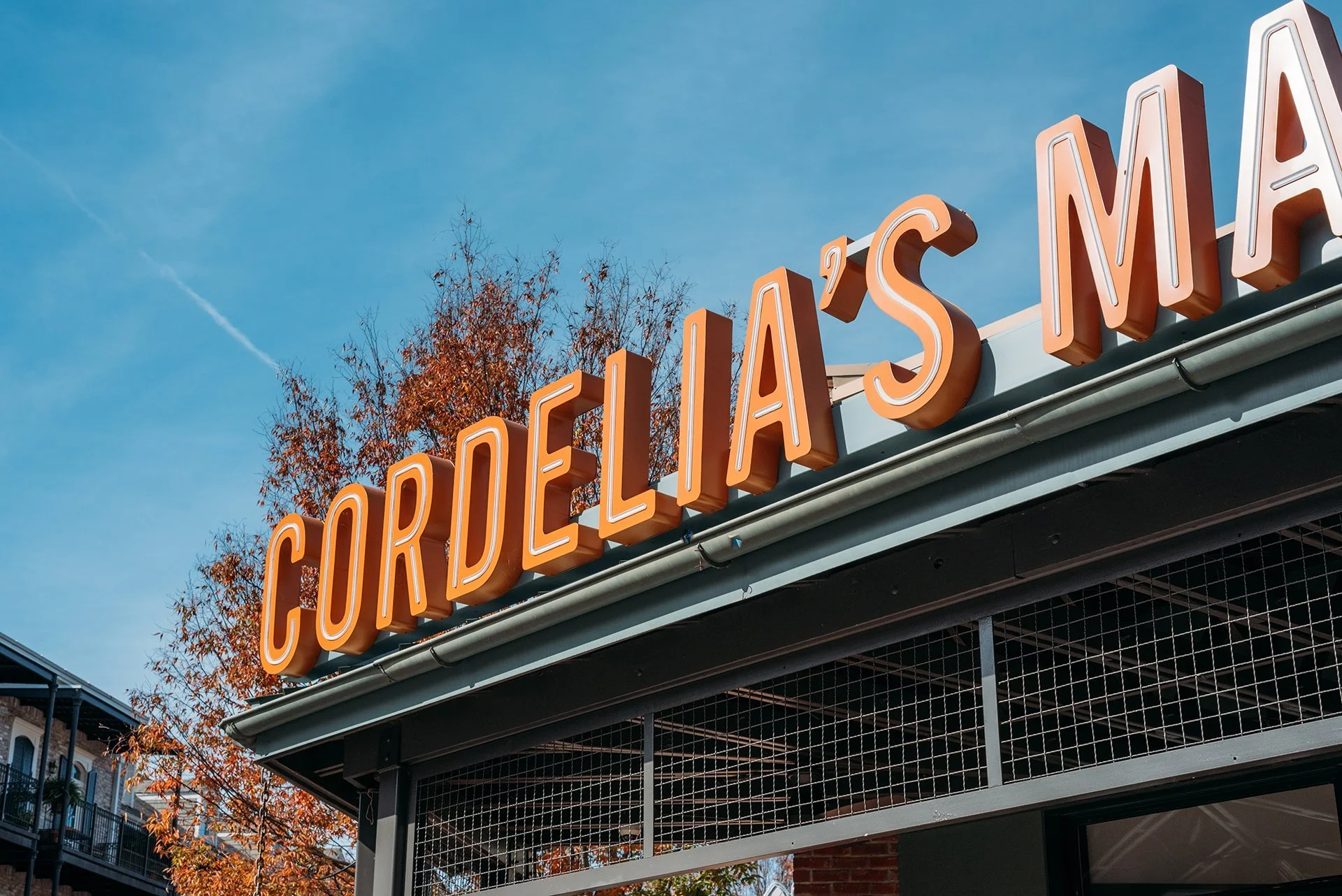
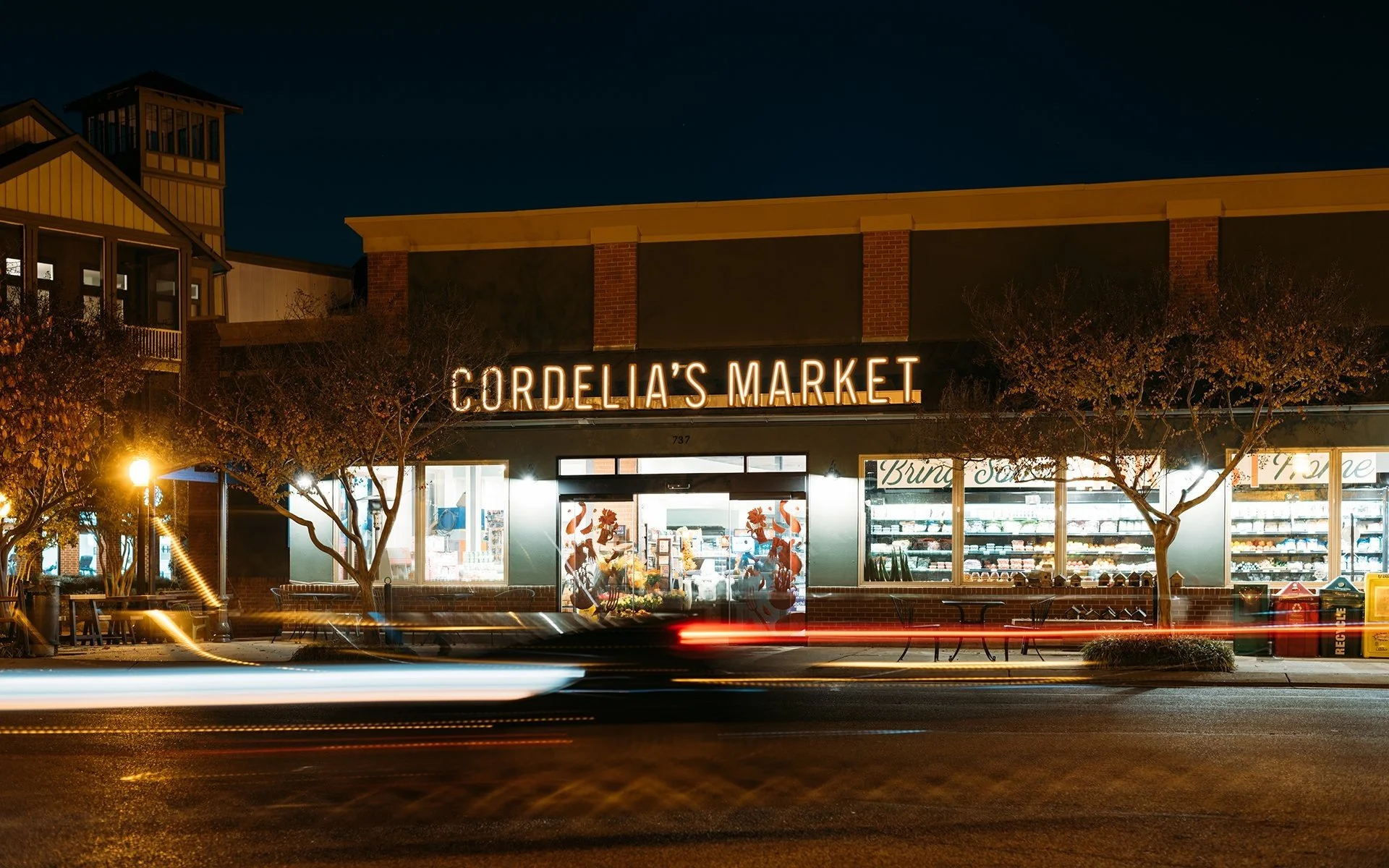
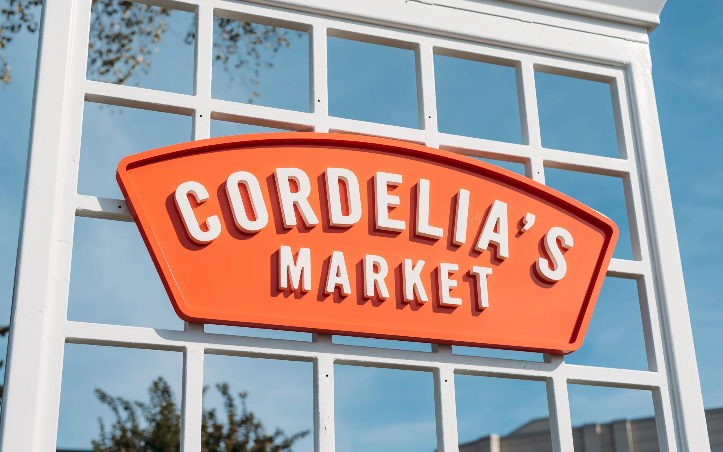
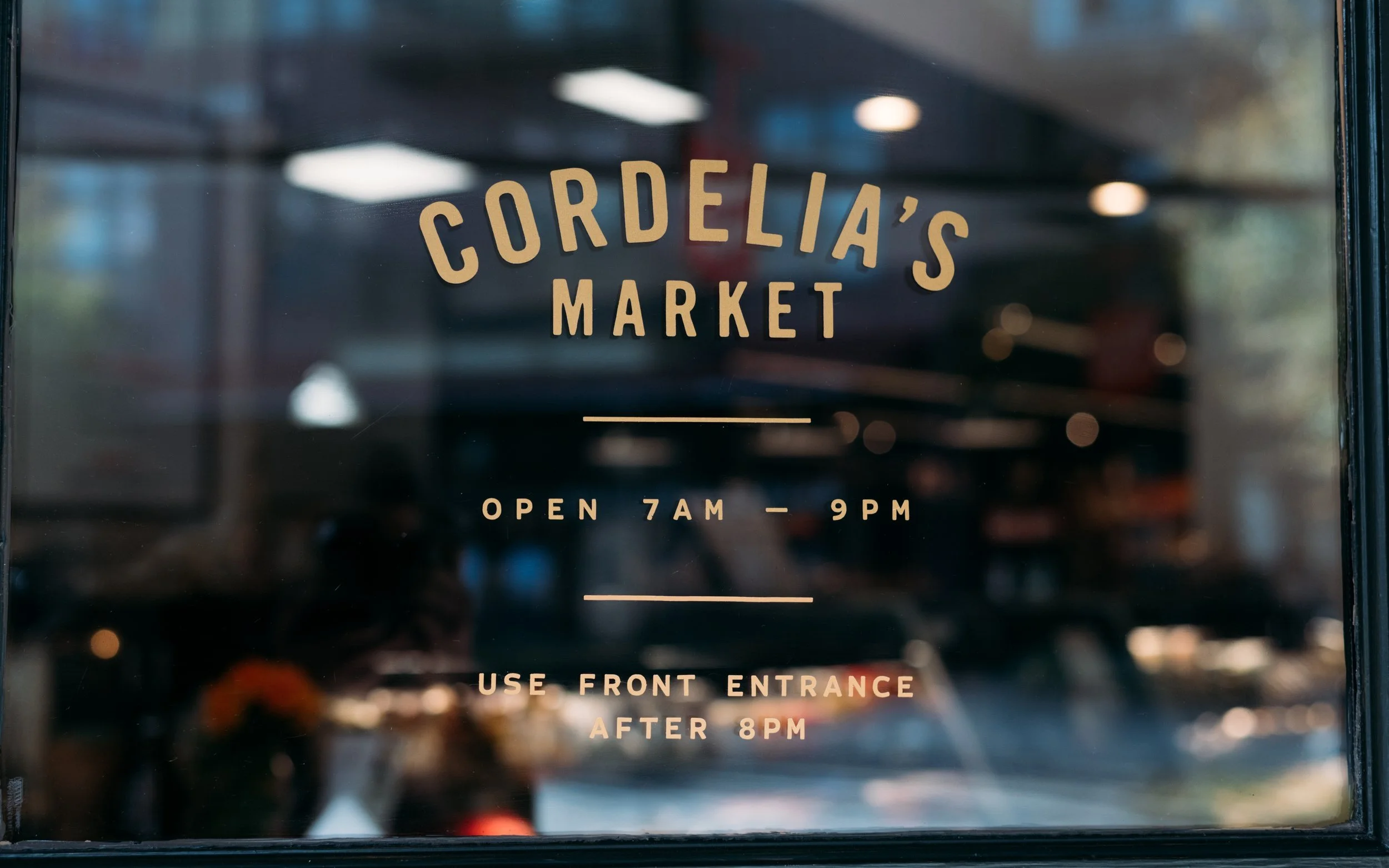
EXTERIOR SIGNAGE
Redefine conversions through intuitive, user-friendly market share
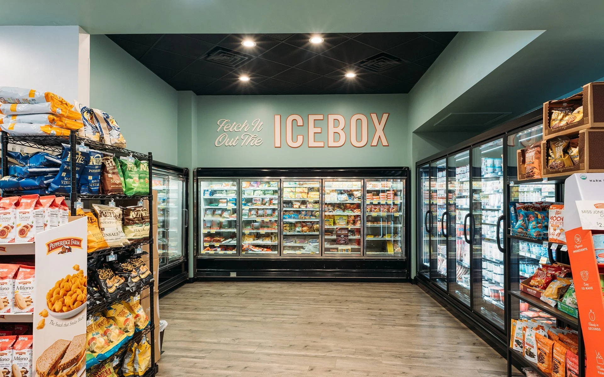

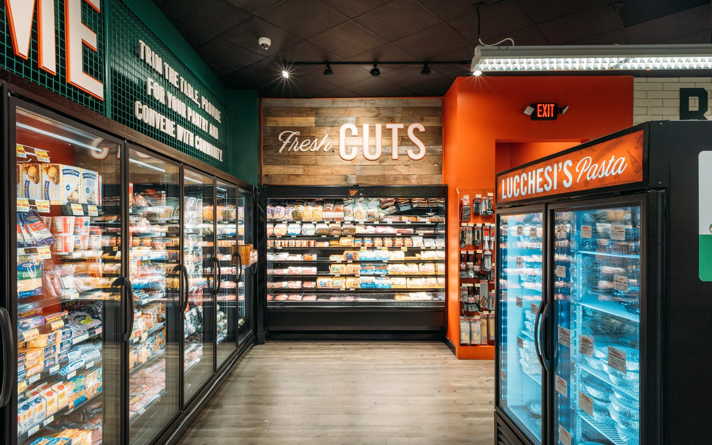
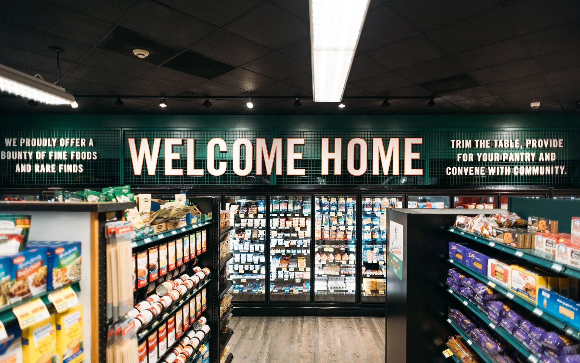
Cordelia’s Market was named after a family matriarch, so we used casual Southern vernacular and residential interior finishes throughout to evoke the comfort and nostalgia of being at Grandma’s house.
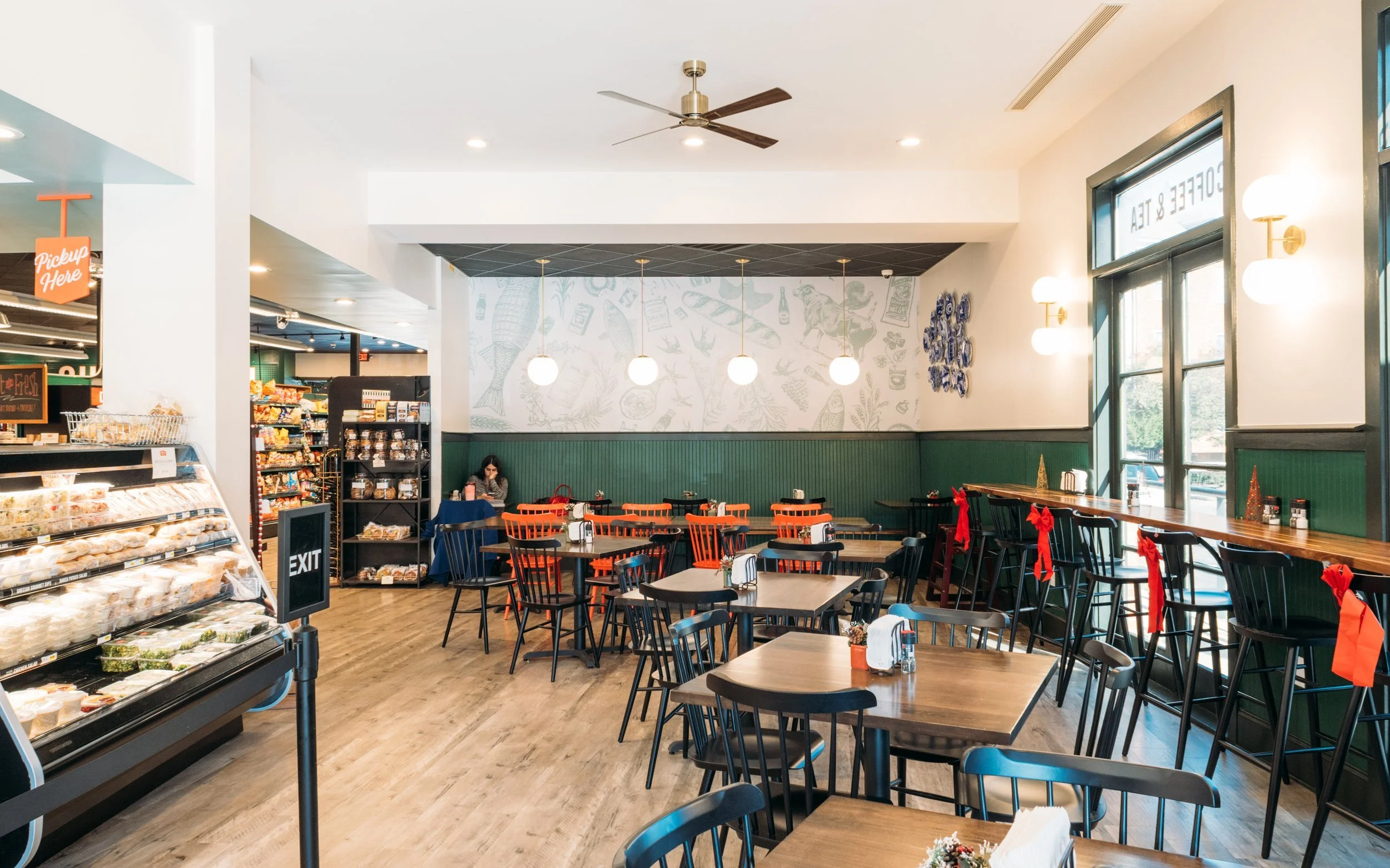
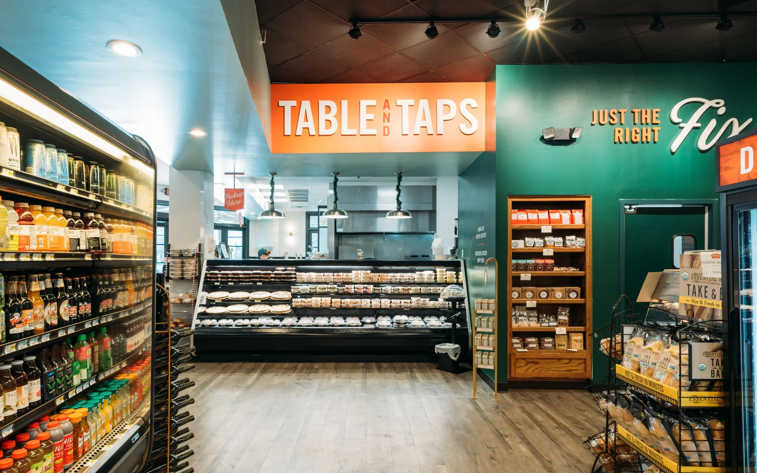
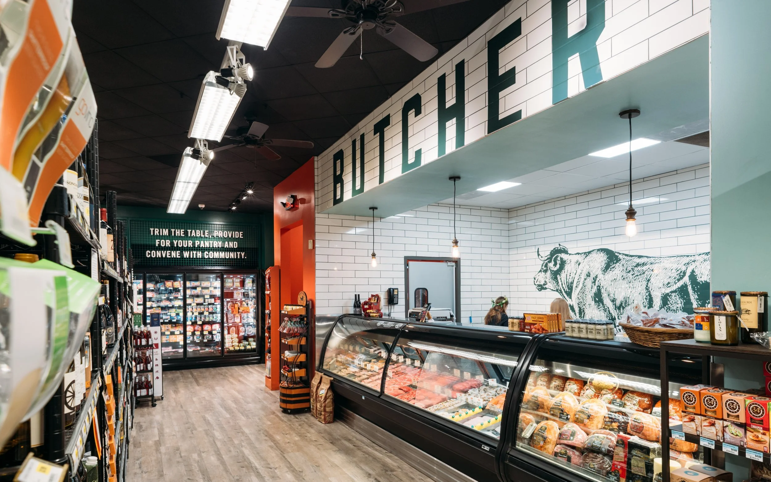
INTERIOR
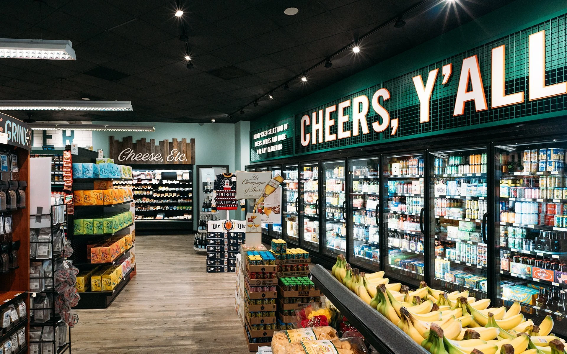
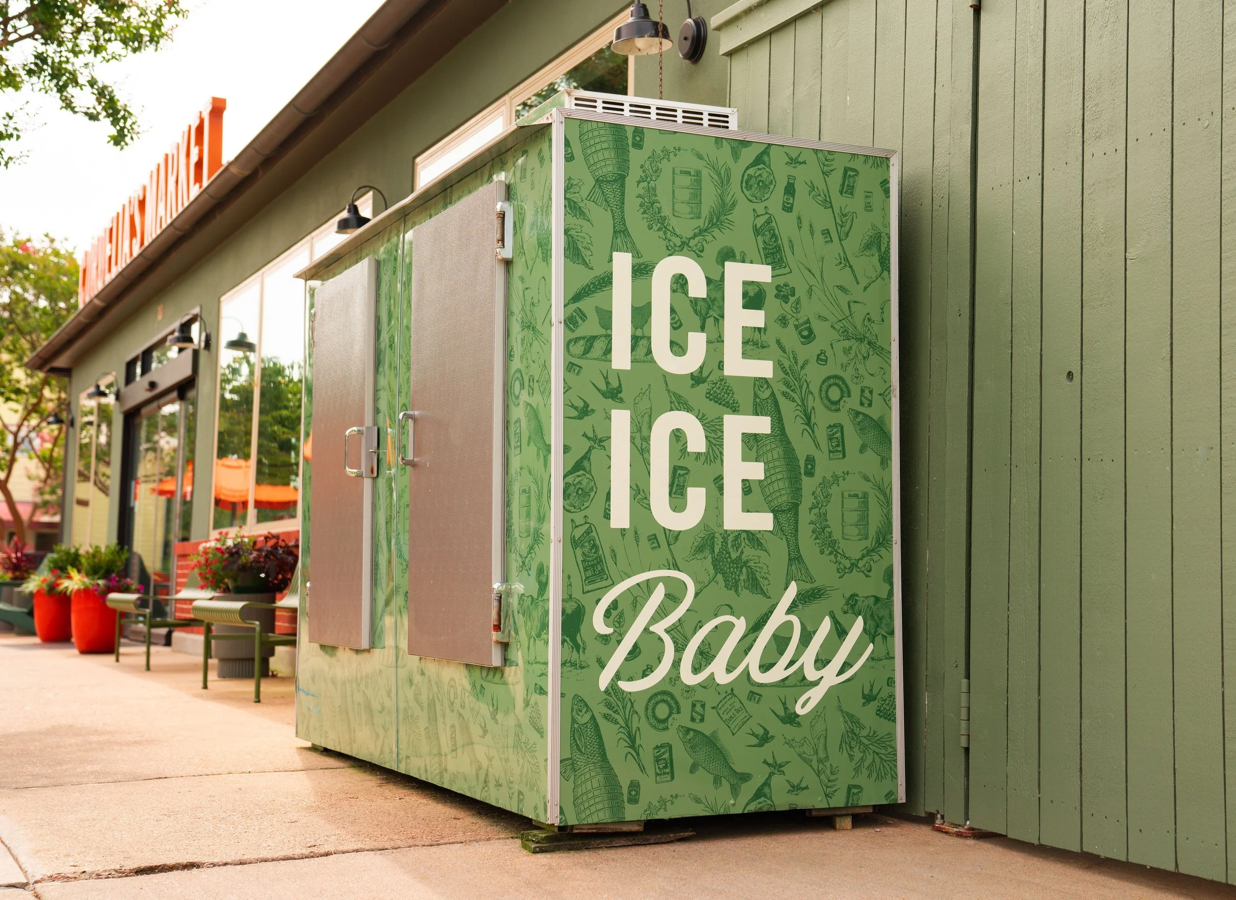
To embrace and encourage the market’s role as a community hub, we shifted the kitchen back away from the café space to create new seating areas intentionally positioned towards the neighborhood and changed the verbiage of the wayfinding from goods-centric solutions to sincere neighborly salutations, just like how you’d talk to a neighbor. Cheers, y’all.
INTERACTIVE
Built for Possibility